Static Ads for Facebook and Instagram: How to Plan Image Ads That Convert?
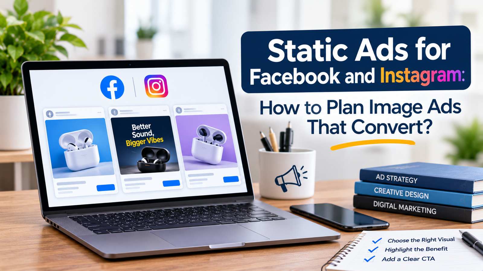
Video gets most of the attention in paid social, so static image ads often end up as an afterthought. Someone opens a design tool, drops in a product photo, adds a discount badge and calls it done. Then the ad underperforms and the conclusion is that static does not work anymore.
The format is rarely the problem. What is usually missing is a static ad strategy: a clear reason for each image to exist, a message built from customer research and a plan for how it will be tested. This guide walks through how I approach static ads for Facebook and Instagram, from the first idea to the first round of results.
Where Static Ads Fit Best
Static ads shine when the message can be understood in a single glance. A strong offer, a clear benefit, a recognizable product or a short piece of social proof can all land in a second or two, which is about all the time a scrolling viewer gives you.
They are also the cheapest way to test ideas. A video may take days to script, film and edit, while a static can be made in an hour. That speed makes statics ideal for learning which angles are worth turning into video later.
Retargeting is another natural home. People who already know your brand do not need a story. They need a clear reminder and a reason to come back, and a simple image often does that job well.
Start With the Message, Not the Design
The most common mistake is opening a design tool first. A beautiful layout cannot rescue a message nobody cares about. Before designing anything, decide what the ad is meant to say and who it is meant to say it to.
Mine Your Customers for Angles
Read your reviews, support emails and comments. Notice the problems people describe and the exact words they use. A review that says a product finally fixed a stiff morning routine contains a better headline than anything invented in a meeting.
Choose One Idea Per Ad
A static ad has very little room. If it tries to explain three benefits, mention a discount and show five products, the viewer will take in none of it. Pick a single idea and let everything in the design support it.
The Anatomy of a Static Ad That Works
Most effective static ads answer three questions almost instantly: what is this, why should I care and what do I do next. Each part of the ad has a job in answering them.
The Headline
The words on the image should be short and focused on the customer's benefit or situation. If the headline could be read in under two seconds and still make sense, it is probably the right length.
The Visual
One clear focal point usually works best, whether that is the product in use, a before-and-after or a real customer. Busy backgrounds and cluttered collages compete with the message and weaken it.
The Proof or Offer
A short piece of evidence, such as a rating, a review line or a clear offer, gives the viewer a reason to trust or act. Keep it small and easy to read rather than letting it take over the image.
The Primary Text and Call to Action
The image does not work alone. The text above it can carry the explanation that does not fit on the picture, while the button and a clear line of copy tell people what to do next. Treat the image and the text as one message split across two places.
Design for Each Placement
Facebook and Instagram show ads in several places, and a single image rarely suits all of them. A square or portrait image works well in the feed, while Stories and Reels need a vertical layout with important elements kept away from the edges, where interface buttons can cover them.
This matters most for Instagram ads, where vertical formats and fast scrolling are the norm. Planning a version for each placement from the start almost always beats cropping one image afterward.
Static Ad Formats Worth Testing
Instead of making many random designs, build a small set of reliable formats and vary the message inside them. A problem-and-solution ad names a frustration and shows the product as the answer. A testimonial ad places a real customer line on a clean background. An offer-led ad puts the deal front and center. A comparison or educational ad shows how your approach differs from the old way of solving the problem.
Testing across formats like these tells you more than testing ten variations of one layout, because each format carries a different kind of persuasion.
How to Test Static Ads Properly
Change one thing at a time. If two ads differ in headline, image, color and offer, a winner teaches you almost nothing. Keep the layout the same and change only the headline, or keep the headline and change only the visual.
Give each ad enough time and budget to gather meaningful data, then read the results together: click-through rate shows whether the message earns attention, while cost per result shows whether the whole journey pays off. Record what you learn so every round starts smarter than the last. A creative strategist builds this learning loop into every account, because winning ads are only useful if you understand why they won.
Common Static Ad Mistakes
Too much text is the classic one. If the viewer has to read a paragraph on the image, they will scroll on. Another is a stock-photo look that feels like a generic advertisement. Real photos, real customers and imperfect but clear visuals often earn more trust.
Running the same image for months is a quieter mistake. Even a good static wears out when the same audience sees it repeatedly, so plan fresh versions before performance drops.
When to Get Help With Your Static Ads
If your images look fine but results are weak, the issue could be the message, the setup or the tracking behind them. A Facebook ads expert can review your account and tell you which one it is. You can also see how this plays out in practice by browsing the case studies.
Frequently Asked Questions
Are static ads still effective on Facebook and Instagram?
Yes. They are fast to produce, easy to test and effective when the message is clear and the offer is easy to understand at a glance. Many accounts use static and video together.
What size should a static ad be?
Square and vertical images are the most common choices for feed placements, while Stories and Reels need vertical layouts. Check Meta's current creative specifications before finalizing your designs, since requirements can change.
How many static ads should I test at once?
Start with a small group built around one idea, so you can read the results clearly. Add more as your budget and conversion volume grow.
Should I use static or video?
Often both. Static ads are handy for quick testing and retargeting, while video can explain more and suit cold audiences. Let your own results decide the balance.
Final Thoughts
A good static ad is not a pretty picture with a discount on it. It is one clear idea, built from real customer language, designed for the placement and tested in a way that teaches you something. Start with the message, keep the design simple and learn from every result.
If you would like help planning static ads for your own account, you are welcome to get in touch and talk through what to test first.
Ready to Implement This in Your Ad Account?
Stop guessing why your Meta ads are stalling. Let's look inside your Ads Manager together and find the high-leverage growth bottlenecks.
Book 15-Minute Strategy Call →